I made an e-commerce loyalty program, sweet.
Client: SweetTooth Year: 2013-2015 Role: Art Director, User Interface & User Experience Designer
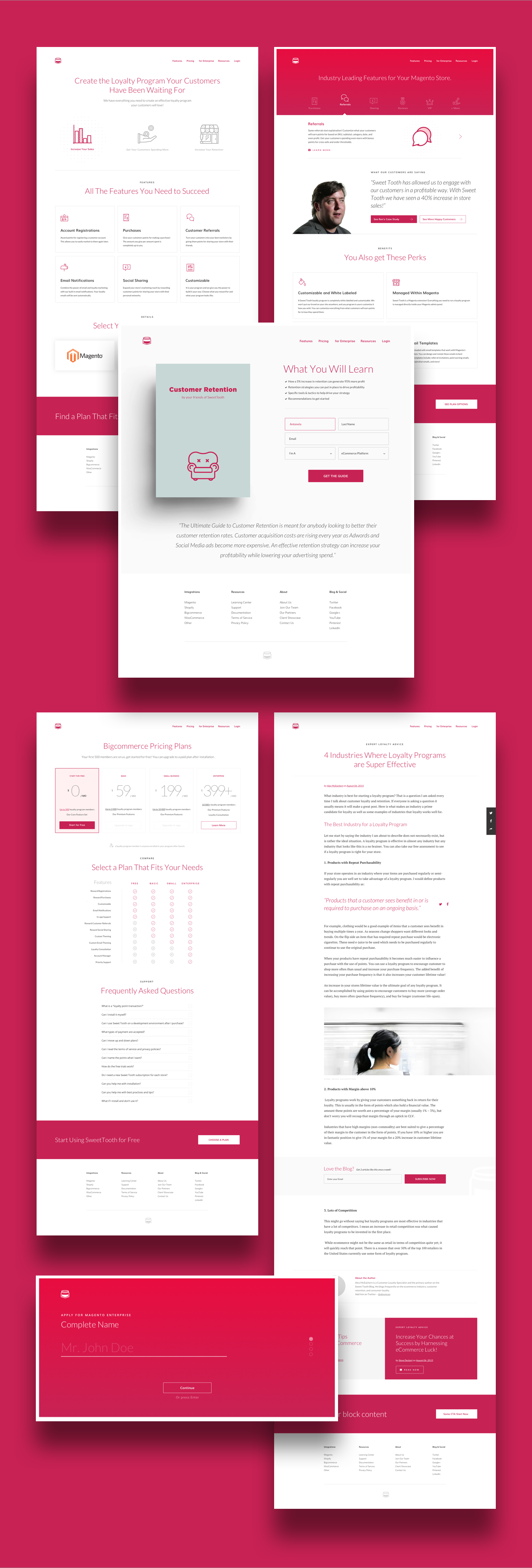
When Mike Rossi called me to work on a Sweet Tooth revamp, I couldn’t be any more excited. Sweet Tooth is a leading company in the e-commerce loyalty programs field. Right from its concept and upto its final implementation, the development of Sweet Tooth was flawless. Once the brand was consolidated, we started working on a second stage. The team needed a flexible system that allowed to them to produce, edit and publish online content without altering the brand ecosystem, so I developed a structure that paved the way for a successful execution of those tasks.
TEAM
1 CEO
1 CTO
1 Content Manager
2 Frontend
FIRST OBJETIVE: NEW BRANDING
During my years of professional experience, I have learnt that the best process to design is to share the task. So when the decision makers are involved in the process, the end result is an expected one.
I almost always use the same process for new brands. However, results are always different, as people have different desires about their company and because brands have different speeches.
At Sweet Tooth, we made a moodboard review, where we set a preliminary approach of visual expectations. This moodboard allows the client that doesn’t have training on design to immerse in a world of images that will represent their own company.
Sweet Tooth helps businesses keep their customers and keeps them loyal to a company's brand. As a brand, they wanted to talk to CEOs and Developers. Sweet Tooth is playful, but it's also effective and refined.
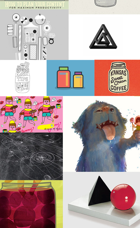

BRAND PERSONALITY ATTRIBUTES
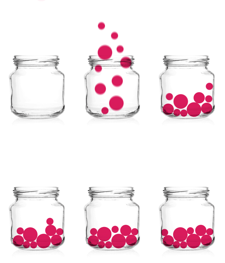
After several concept tests, I've chosen a glass jar as the icon because it is usually the place where candies are stored in all homes. Thinking of it as an analogy: candies are users and Sweet Tooth is the transparent tool that easily identifies and groups them. Additionally, inside the jar they are always safely stored.
When the concept was approved and embraced by everyone at Sweet Tooth, I took some time to explore the shape until arrived to the final version.
FINAL VERSION

SECOND OBJETIVE: MODULAR WEBSITE
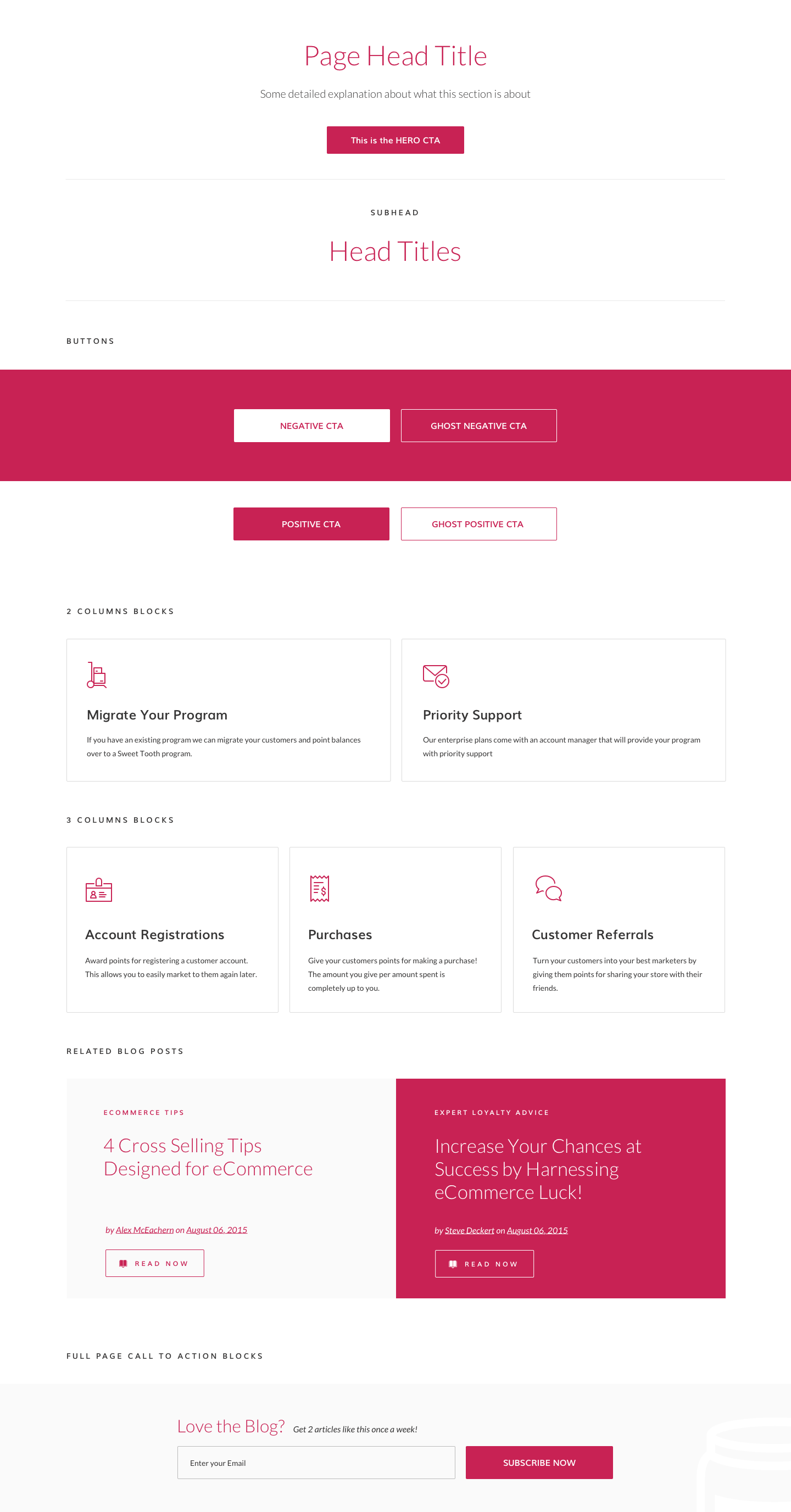
Sweet Tooth marketing team had the need to independently edit content on a daily basis and still keep the institutional image. That is why we decided that creating a modular interface program was the best option.
Based on an atom structure we created a system from each element that allowed us to cover all publishing needs.


Yes! I also made some illustrations!


GA Retrospective
+74,5%
New Sessions
-36,8%
Bounce Rate
+120k
New Sign Up
Skills
Art Direction
UI Design
UX Design
Branding
Typography
Animation
Deliverables
Wireframes
User Flows
High-Definition Mockups
Interactive Prototype
Style Guide
"Antonela was extremely helpful both with the initial design of the Sweet Tooth brand, but also with subsequent redesigns of our website. We were looking to appear more sophisticated while increasing some key conversions on our site. Antonela was critical to helping us do this all within budget!"
- Mike Rossi, CEO of SweetTooth
FINAL THROUGHS
Working with the Sweet Tooth team was a great challenge. Always in the search for optimization and excellence in every stage of the process, we were able to assemble as a remote team and obtain this result. This project tested all my designer skills and I am very happy for having been part of this transformation. If you are thinking of a similar project, just write me.
